Amazon Case Study
500 exercise videos, narrowed to the one that fits
Overview
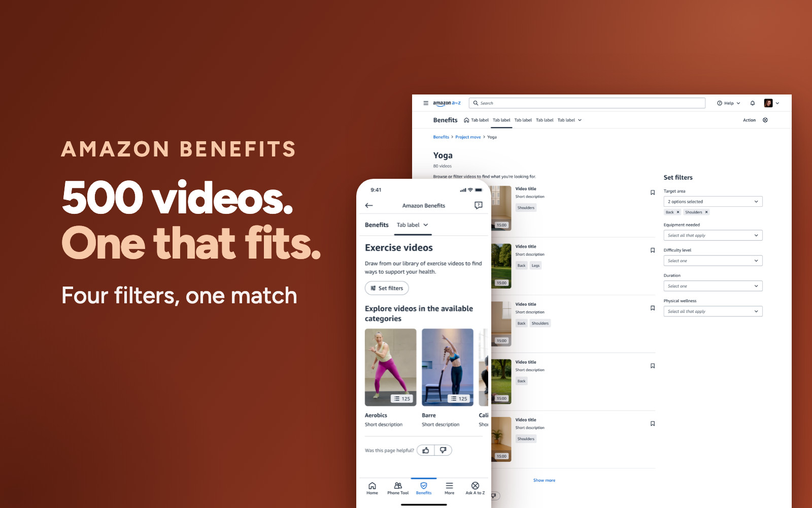
I led the design of an on-demand exercise video library built into Amazon's benefits experience. Five hundred videos across categories like Yoga, Cardio, Barre, Calisthenics and HIIT, with filters that let employees narrow the whole library down to the handful of workouts that fit their body, their kit and the time they actually have.
Goals:
- Turn a passive benefit into something employees actually discover and open.
- Make a 500-video library feel navigable, so the first session starts with a workout rather than a scroll.
- Give people a reason to come back, not just visit once.
The Challenge
A benefit nobody could find
Amazon employees already had access to a wellness benefit, but almost nobody was using it. Fitness content sat behind a generic entry point on Benefits Home, with no sense of what was inside or who it was for. Opening it meant landing in five hundred videos with no way to narrow them, so most people never came back after the first look. The problem was never content supply. It was that a library that large is unusable without a way to cut it down.
"I opened it once, saw hundreds of videos, and had no idea which one was for me. I just closed it."
The pattern we heard again and again: interest was there, but the first screen gave people nothing to hold on to.Drive real engagement with an existing wellness investment, not just one-time clicks.
Find workouts that fit my goals and level, without wading through everything first.
Problem to solve
The benefit existed, but discovery and relevance did not. Employees hit an unfiltered library with no clear first step, so a benefit meant to support wellbeing went largely unused.
Videos in the library, with no way to narrow them down to the ones that fit you
Research
Talking to employees, the same pattern kept surfacing: people were open to working out, but not to searching for a workout. Nobody described wanting more content. What they described were constraints: a sore back, fifteen minutes between meetings, no equipment in a hotel room. The library had no way to hear any of them.
- Relevance beats volume: people wanted a handful of workouts that fit them, not a catalogue of five hundred
- Constraints are the real query: body part, equipment to hand, time available and level, not a category name
- Return visits need memory: people wanted to get back to a workout that worked without hunting for it again
- Trust needs detail: before pressing play, people wanted to know the trainer, the length and the kit required
Each filter is a constraint people already had in mind, so every choice cuts the library down instead of adding a decision.
Category narrows the field, then five facets take it to a shortlist you can actually watch.
full library
constraint people have
the first workout
Every filter subtracts. Nothing asks the employee to describe themselves first.
How might we
How might we let an employee describe their constraints, a sore back, no equipment, fifteen minutes, and get a workout that fits without asking them to set anything up first?
Relevance comes from filters applied in the moment, not a profile built in advance
Design Strategy
The obvious answer was a recommendation engine: ask people about their goals up front, then serve a personalised feed. But that puts a form between an employee and the thing they came for, and it only works once there's enough behaviour to learn from. So I put the options on the table with the tradeoffs spelled out, and we aligned on filters: personalisation the employee performs themselves, in the moment, with no profile required.
The approaches I brought to product and engineering. We aligned on faceted filters: the employee's constraints do the personalising, so relevance arrives on the first visit without a profile or a form.
Two decisions shaped everything after. The filters had to map to how people actually describe a workout, by body part, equipment, level and length, rather than to how a content library is catalogued. And saving had to be one tap from anywhere a video appears, because the research was clear that getting back to something that worked mattered as much as finding it the first time.
The reframe
The problem was never a shortage of content, it was a shortage of ways to say no to most of it. Once filters were framed as subtraction rather than setup, five hundred videos stopped being a burden and became a library deep enough that a shortlist always had something in it.
Every filter removes videos, so each choice makes the decision smaller, not bigger
Solution
The experience opens straight into the library. Categories give it a shape, five filters cut it down, and a bookmark on every video means the workouts that fit are one tap away next time. Nothing is asked of the employee before the first workout plays.
The journey, end to end
From opening the benefit to keeping a workout, five steps, none of them setup. Land in the library, narrow it with search and filters, read the detail that decides it, then save it so the next visit starts from a shortlist.
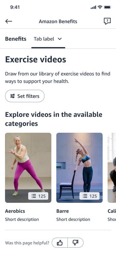
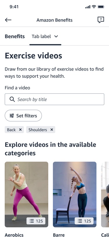
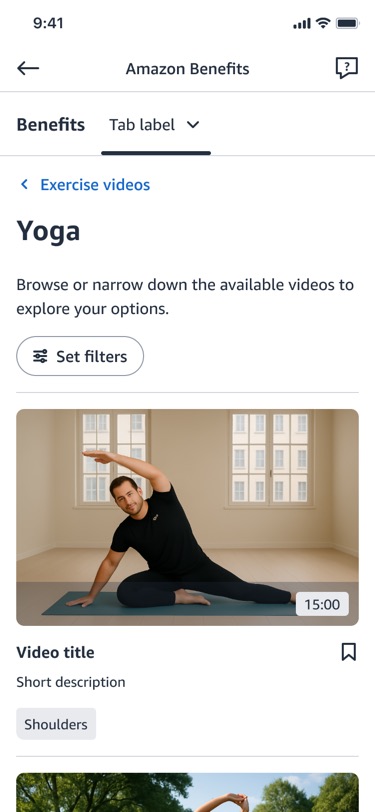
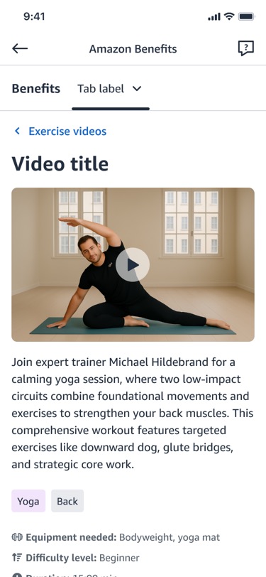
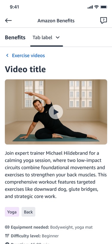
The mobile journey. No splash, no questionnaire, no account setup: the first screen is already the library, and every screen after it is either narrowing or watching.
Walk through the interactive prototype Filter, narrow, save, and return, clickable in FigmaFilters built from constraints, not categories
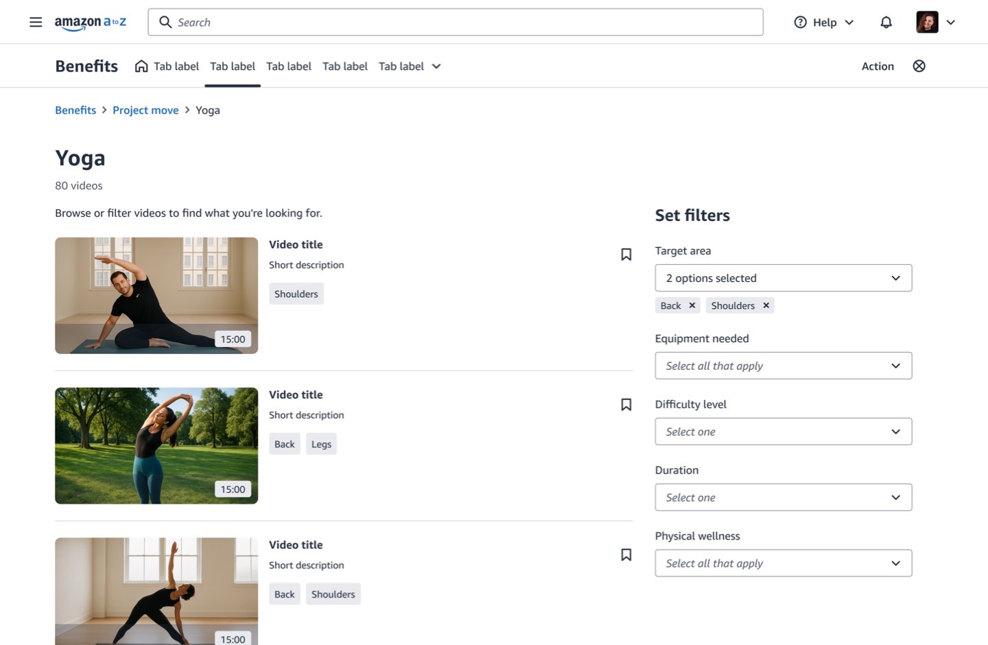
Five facets, each one a sentence an employee had already said in research. Target area for the sore shoulder. Equipment needed for the hotel room with no kit. Difficulty level for the first week back. Duration for the gap between meetings. Physical wellness for the goal underneath all of it. Selected values stay visible as removable chips, so the state of the query is always readable and always reversible.
Saving, so the second visit is faster than the first
A bookmark sits on every video card and every video page. Saved workouts then surface in their own row on the landing page, above the categories, so returning employees land on the things that already worked rather than starting the search again.
Desktop, first visit through to return visit. Click any screen to open it full size. The Saved videos row only exists once something is in it, so the landing page grows a shortcut the more the library is used.
Trainer, duration, difficulty, equipment and a transcript link, all before pressing play.
Bookmark from a card or the video page, and it appears in Saved videos on the landing page.
The same system on both screens
Desktop puts the filter rail alongside the results, so the effect of a change is visible as it happens. Mobile collapses the same five facets behind a Set filters control to protect the small screen, then returns to the same filtered list. Same model, same tags, same saved state, different amount of room.
Why filters over recommendations
A recommendation engine needs behaviour before it can help, which makes the first visit the worst one. Filters invert that: they work perfectly on day one, for a brand-new employee, with no history at all, because the employee already knows their own constraints.
Relevance on the very first visit, with nothing known about the employee
Impact
It shipped as the exercise video experience inside Amazon Benefits, turning an unused library of five hundred videos into something an employee could narrow to a workout in a few taps. The filter model meant relevance did not depend on a profile, a questionnaire, or enough watch history to train a model: it worked on the first visit, for everyone.
The design was also built to grow into personalisation rather than replace it. Every video carries the same structured tags the filters use: body area, equipment, difficulty, duration, wellness goal. So the filter choices employees make are exactly the signal a recommendation row would need later. The saved-videos row is the first step: a place on the landing page where a personalised set already lives, ready to be joined by suggestions once there is behaviour to learn from.
What I learned
More content was never the answer
The library already had five hundred videos and nobody used it. Volume was the problem, not the fix. The design work was all in giving people a way to say no to most of it quickly.
Filters beat recommendations on day one
A recommendation engine is at its worst on a first visit, when it knows nothing. Filters are at their best there, because the employee already knows their sore shoulder and their fifteen free minutes. Let them say it.
Name facets in the user's words
"Target area" and "Equipment needed" are how people describe a workout. Cataloguing vocabulary would have been more accurate and far less usable. The filter labels were a copy decision as much as a taxonomy one.
Design the second visit too
Finding a good workout once is only half of it. Bookmarks and a saved row on the landing page were what turned a successful search into a habit, and they cost far less than a recommendation system.