Amazon Case Study
A verification system projected to save $27–51M a year
I flipped Amazon's dependent eligibility verification from "block until verified" to "cover immediately, verify in background", across web, mobile and agent tools for 750K+ employees.
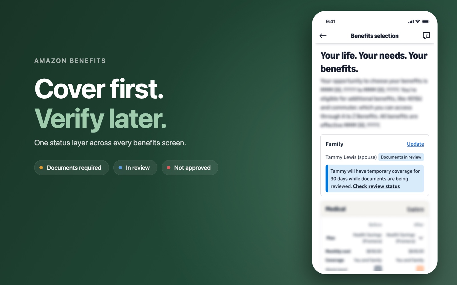
Overview
Adding a spouse or child to your benefits should be simple. At Amazon it meant proving eligibility, and the old process held coverage back until you had. Legitimate families waited, some groups were flagged more than others, and the plan still paid for enrollments that were never eligible. I redesigned the system around the opposite assumption: cover everyone immediately, then verify in the background inside a 30-day window. The bet was that slow completions signalled friction, not reluctance, and the pilot bore it out. Shipped across web, mobile and agent tools with engineering, legal and operations.
Goals:
- Reach 80%+ verification completion within the window.
- Protect plan integrity without a company-wide audit.
- Remove coverage anxiety for the eligible majority.
The Challenge
What was happening
Picture someone who just got married, adding their spouse to their health plan. Adding a dependent happens in one system. Enrolling in benefits happens in another. The two don't talk to each other, so a single task, "add my family member and keep them covered," was already split across disconnected places.
"I got married last month and I need to add my spouse to my benefits. I'm not sure what the process is or what documentation I need to provide. Can you help walk me through it?"
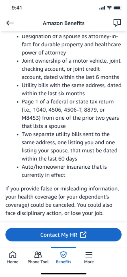
Real support contact. Life-event queries like this took 39% longer to resolve than average.Then it got worse. If the dependent was flagged for verification, the only path forward was "Contact HR." The employee left the flow, opened a support case, and got into back-and-forth conversations with an agent to work out what to submit and whether it passed. There was no self-service way to upload a document, and no visible status anywhere. Coverage sat in limbo while the emails went back and forth.
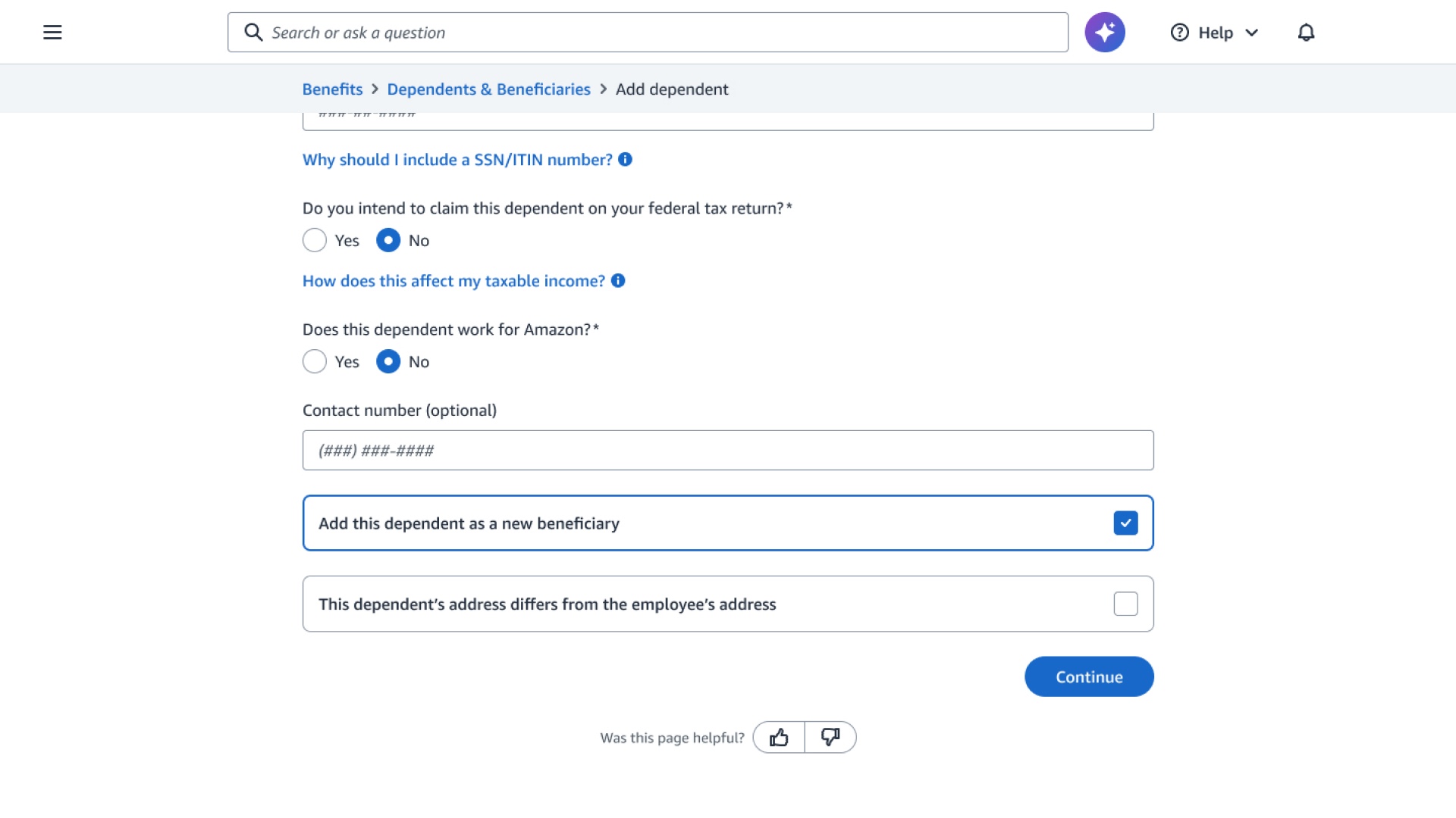
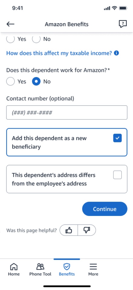
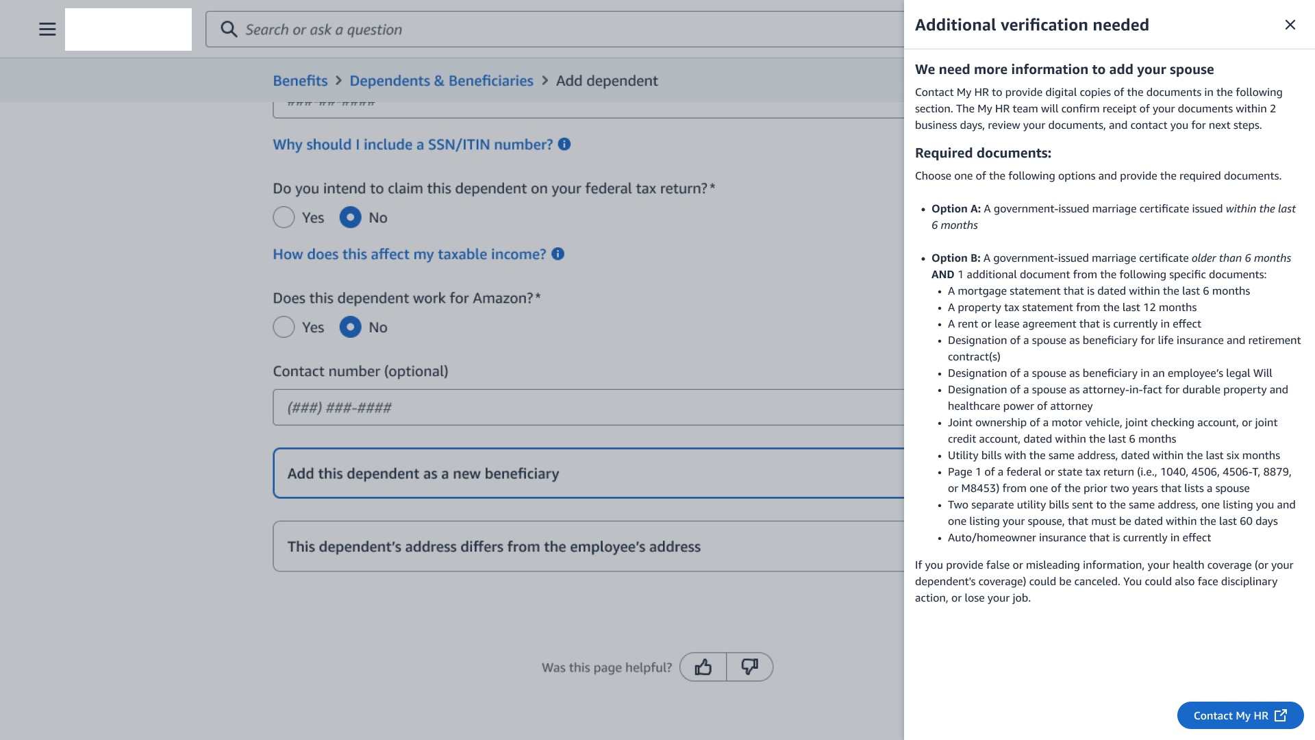
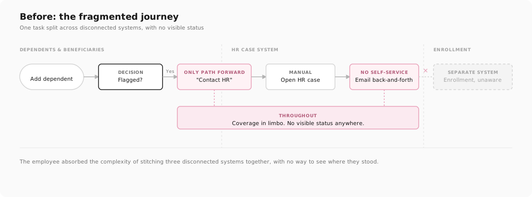
The before journey: a task split across separate systems, an HR-case detour with no self-service, and no visible status the whole way through.
An audit flagged a meaningful share of enrolled dependents as potentially ineligible, a real cost risk to the health plan. But the process built to catch that was doing collateral damage: 72% of the people it flagged were actually eligible. They just couldn't get through it.
Reduce ineligible benefit spend while maintaining employee trust.
Know my dependent is covered while I gather verification documents.
Problem to solve
The task spanned disconnected systems and a manual HR case, with no shared status. Employees couldn't self-serve and couldn't see where they stood, so even eligible families crawled through it while coverage sat in limbo.
of flagged employees turned out to be eligible. The process, not real ineligibility, was the barrier
Research
The number that reframed everything wasn't about who failed to respond. It was how long the task itself took. Adding a dependent and getting them verified meant hopping across separate systems and page after page, and while an employee did all that, the dependent had no coverage. The delay was the problem, not the people.
Adding a dependent and getting them verified meant weaving through page after page across separate systems.
The whole time, the dependent had no coverage. The delay was the pain, not the people.
one dependent
to move between
each review
One task, seven stops, three systems, and it still ends with coverage pending.
When we traced a real case end to end, the task never sat still in one place. An employee started in the benefits portal, got bounced into an HR case, jumped out to a policy article to check the rules, then back again to see whether the dependent had coverage yet. Each hop was a fresh page, a new system, and no shared status carried between them.
Employees taking a long time, read as people dragging their feet or hiding ineligible dependents.
One task scattered across systems with no shared status, so it simply took a long time to finish, longer still when flagged.
Four barriers came up again and again:
- Fragmented journey: adding a dependent, verifying, and enrolling lived in separate systems
- No self-service: the only path was an HR case and manual conversations
- No visible status: no way to see if documents were received, in review, or approved
- Coverage limbo: no clear answer to "is my family covered right now?"
The reframe
The slow-down wasn't reluctance, it was friction. Pull the task into one place, give people a status they can see, and the same eligible families would get through far faster.
across 3 separate systems to verify one dependent, so the design goal was to collapse that into one clear path
How might we
How might we make verification feel like one clear, self-service journey, when the systems behind it are separate and can't be merged?
Verification window proposed, giving employees time to gather documents without losing coverage
Design Strategy
The first instinct was to block higher-risk cases at enrollment until they verified. Efficient on paper, but it delayed coverage for legitimate families and singled out some groups more than others. So we flipped it: everyone gets covered immediately, and verification runs in a 30-day window in the background.
Before committing, I put four approaches on the table with the tradeoffs spelled out, so the decision was made with eyes open, not by gut.
The options I brought to Benefits Science, Legal, Operations, and leadership. We aligned on the 30-day window together.
That flip became the whole design: dependents get immediate coverage while a 30-day window runs in the background. Every touchpoint answers the three questions employees actually ask.
- "Is my dependent covered right now?"
- "What exactly do I need to submit?"
- "What happens if I miss the deadline?"
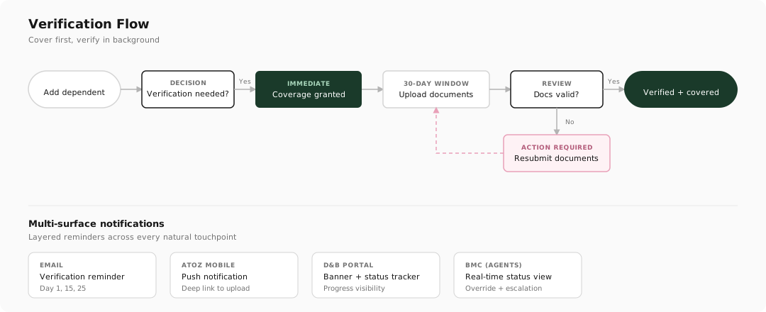
The redesigned flow: immediate coverage with verification running in the background over 30 days.
The real constraint
I couldn't merge the systems. Adding a dependent, uploading documents, and enrolling would stay in separate tools, and the upload itself still lived in a different internal portal. Rebuilding that architecture wasn't on the table.
So instead of forcing everything into one system, I designed a consistent status layer across every benefits touchpoint. Wherever an employee looked, the enrollment page, the dependent's profile, the benefits home, they'd see the same thing: this dependent's verification status, a plain-language message about what it meant for coverage, and the days left to submit. The document upload could stay where it was, as long as the status and the countdown followed the employee everywhere else.
Working toward it
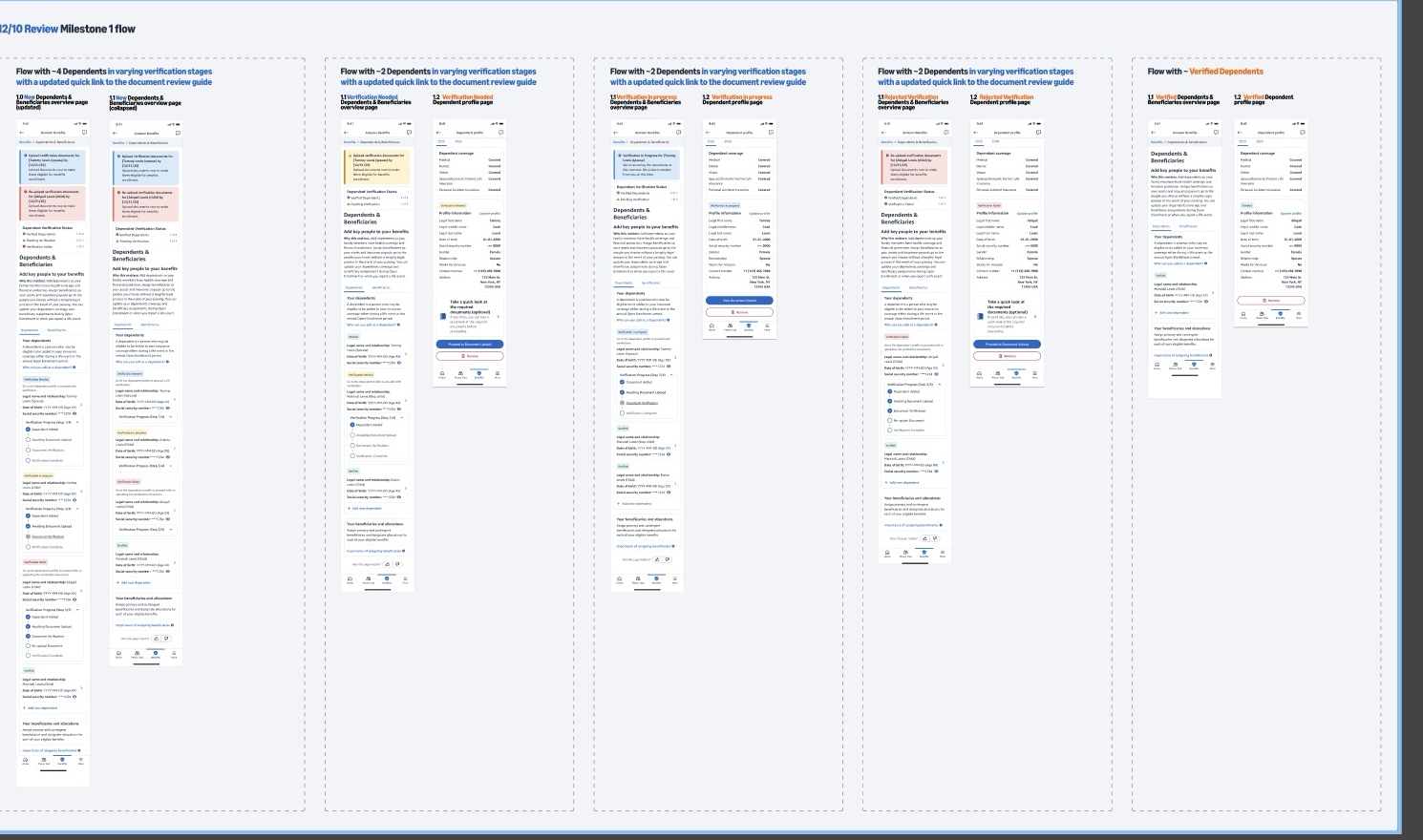
Getting to that answer took a few wrong turns first. Early on I tried explaining the cover-first model with a bottom sheet that popped up over the enrollment page, and building the process into the dependent's profile as a step-by-step tracker. These are rough screens, closer to thinking out loud than final work. Each one made the process legible in a single spot, then showed me its own limit: a sheet you dismiss and a tracker on one page both left the rest of the journey blank. That is what pushed me toward carrying the status everywhere instead of parking it in one place.
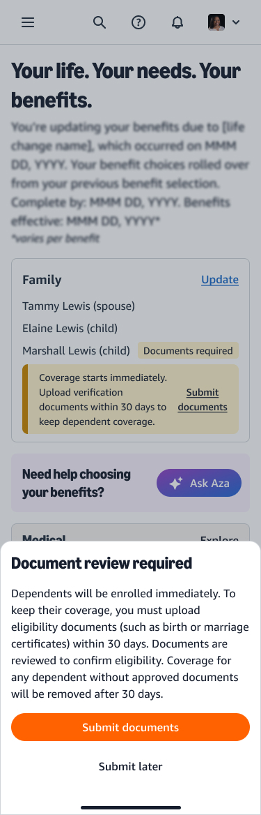
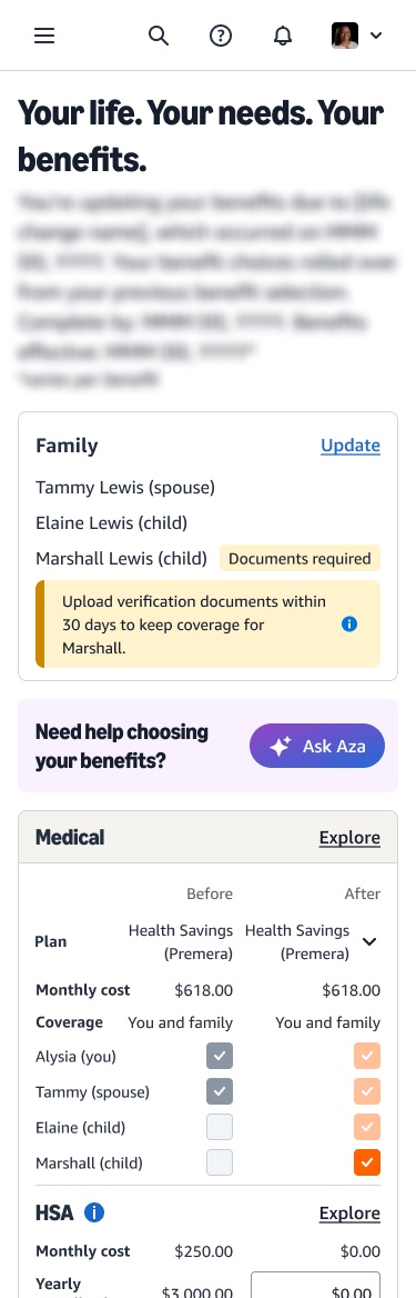
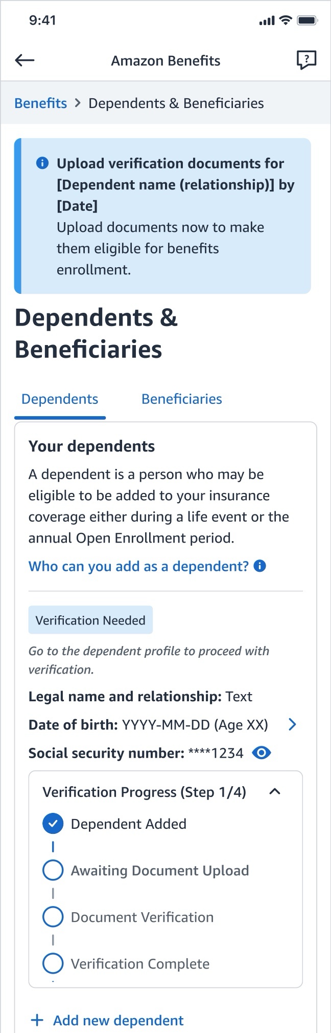
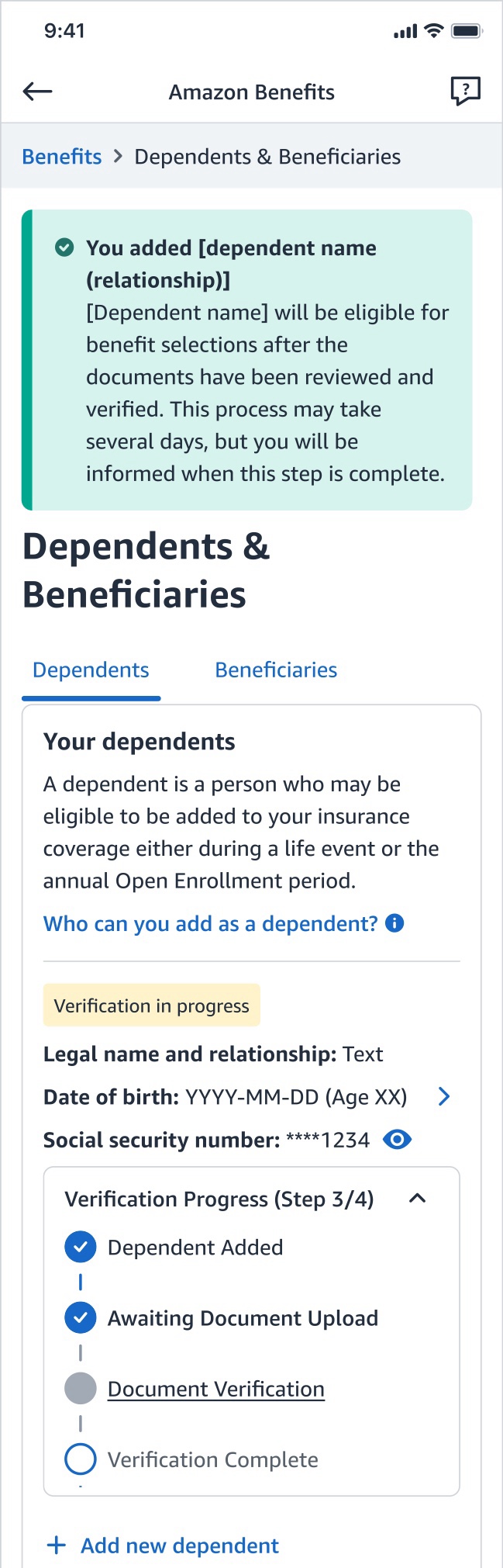
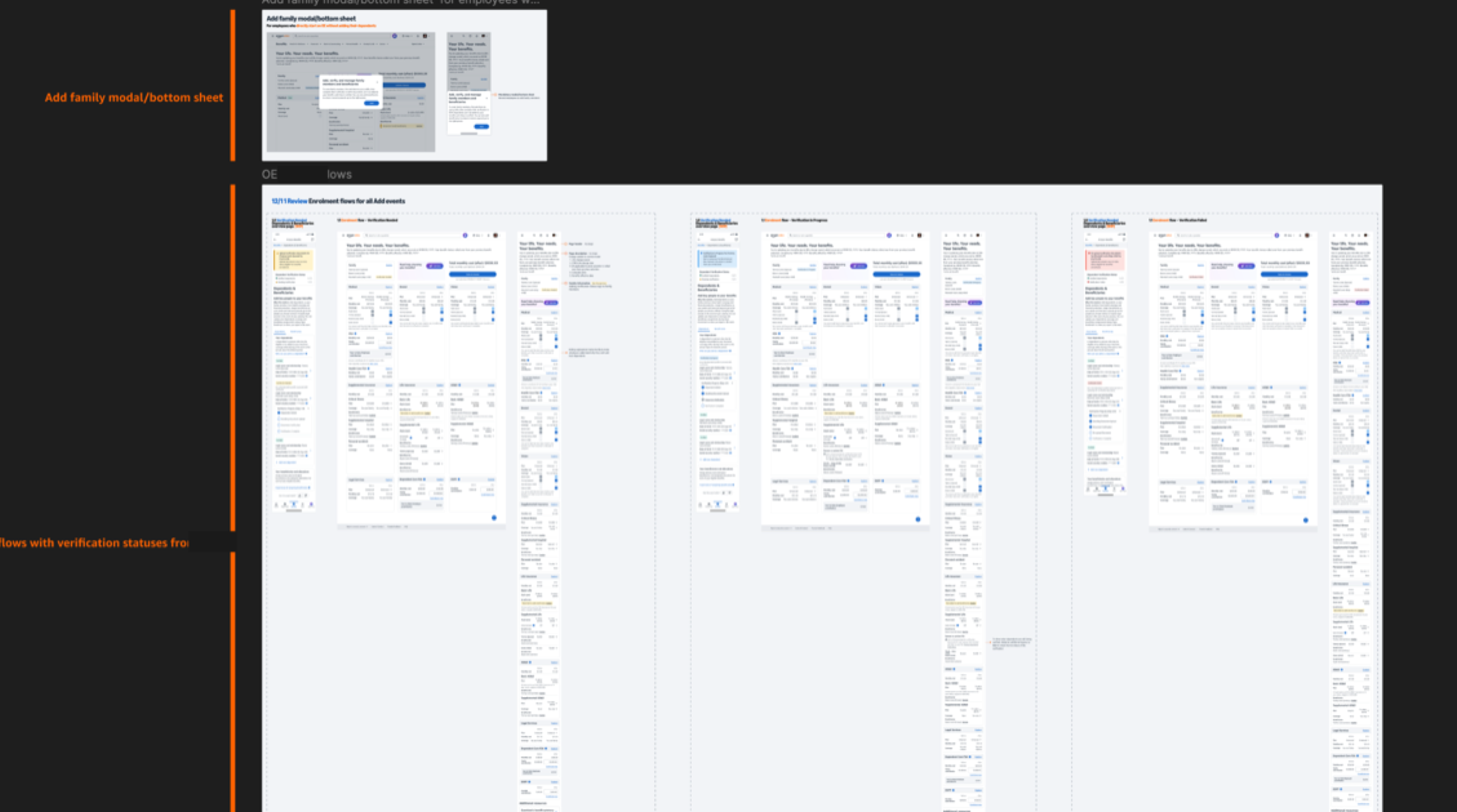
Early exploration: a bottom sheet to explain the 30-day model, and a step tracker on the dependent's profile. Both worked in one spot but left the rest of the journey blank, which is what pointed me at a status that follows the employee everywhere.
Solution
The systems stayed separate, but the story stopped being fragmented. Coverage starts the moment you add a dependent, and every benefits touchpoint shows the same status, the same plain message, and the same countdown, with a deep link out to upload when you're ready.
Every state says the same thing about coverage
The old process had one message for a flagged dependent: contact HR. I wrote four, one per state, and held every one of them to the same rule. Whatever the status, the sentence has to answer "is my family covered right now?" before it asks the employee for anything. That rule is why none of these read as a warning.
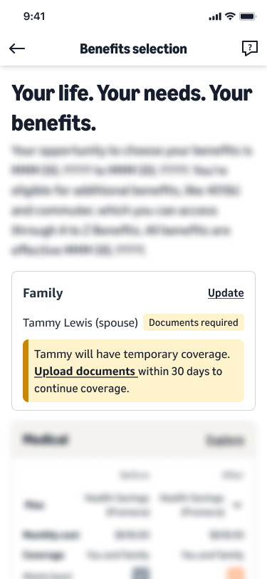
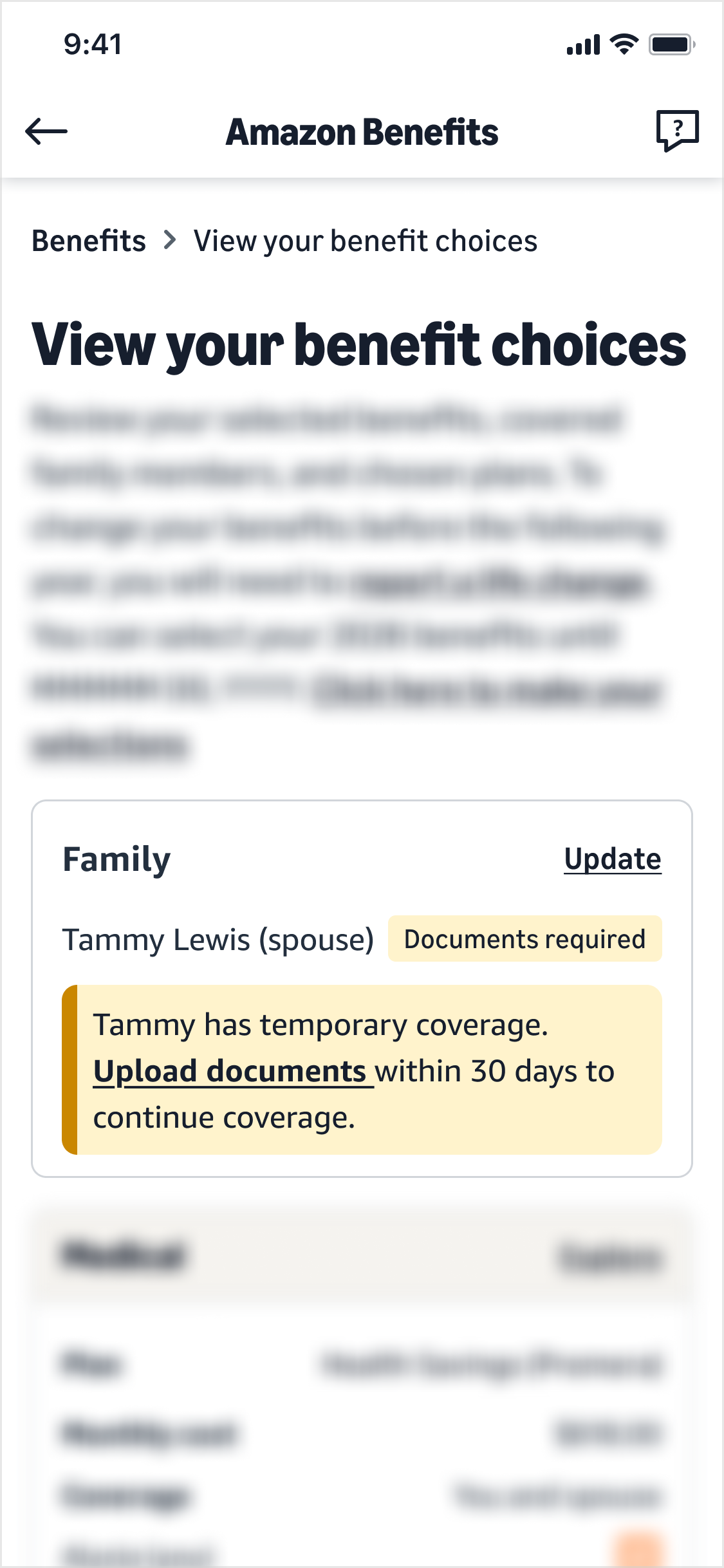
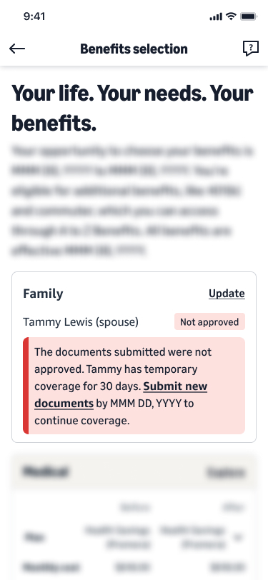
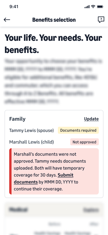
"Tammy has temporary coverage. Upload documents within 30 days to keep it."
Covered, 30 days left
"Tammy has temporary coverage while we review her documents."
Covered, nothing to do
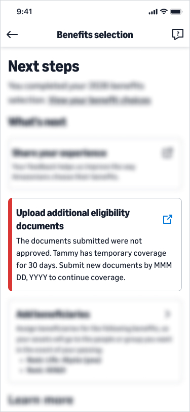
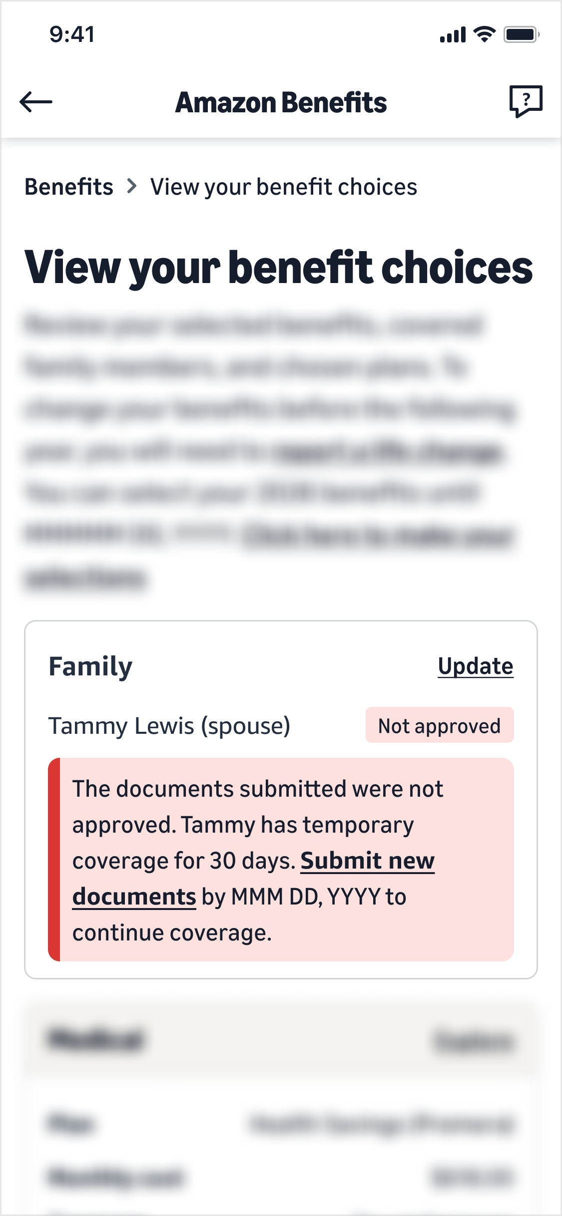
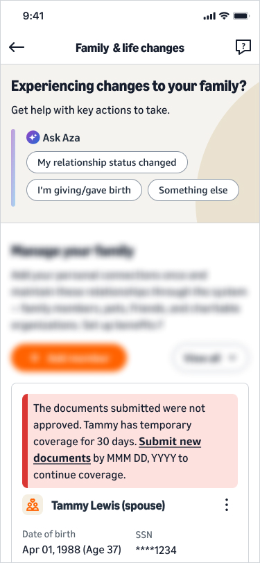
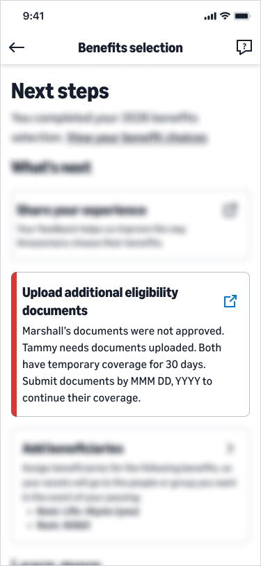
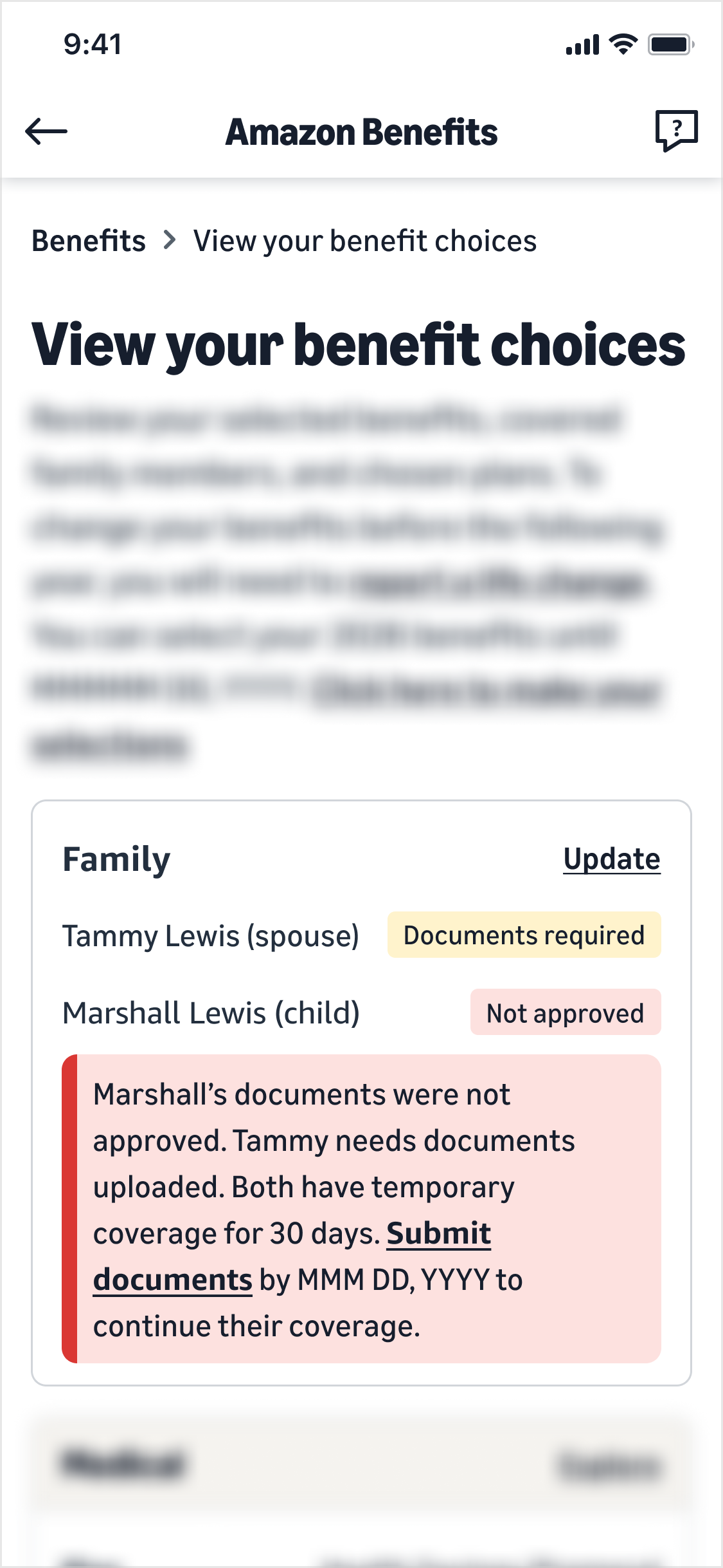
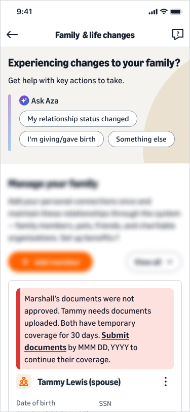
"Tammy's documents were not approved. Submit new documents within 30 days to continue coverage."
Still covered, clock resets
No note at all. The dependent simply sits in the family list like anyone else.
Covered, permanently
The four states as language rules, before any of them became a screen. Every message leads with coverage, then the ask. A rejection is a detour, never a dead end.
The same status, everywhere you look
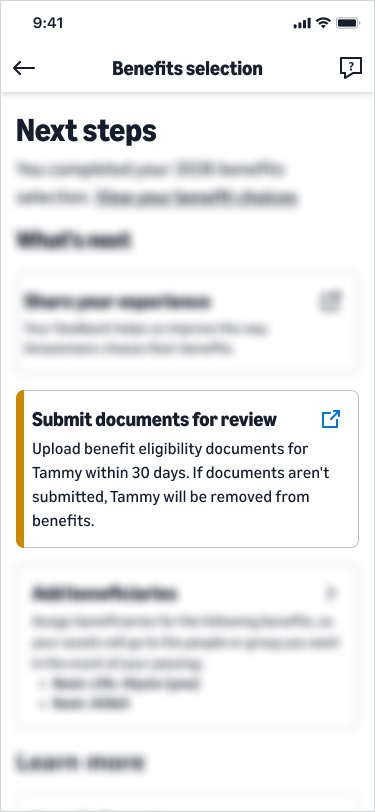
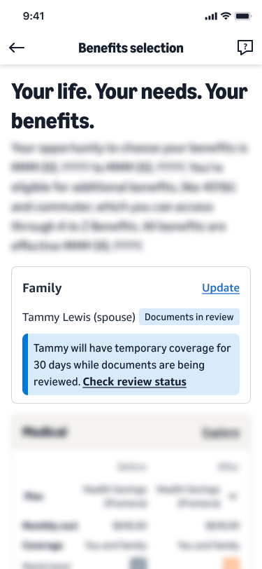
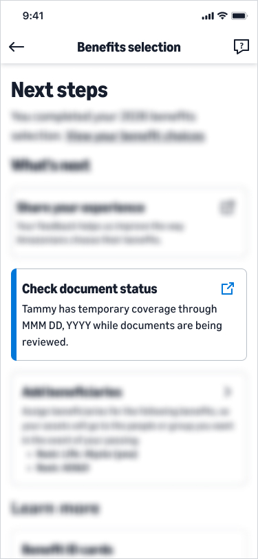
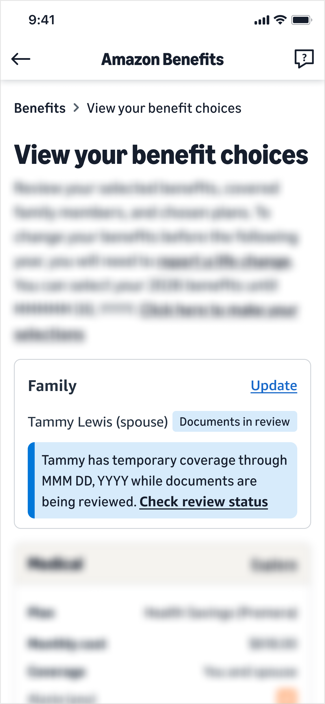
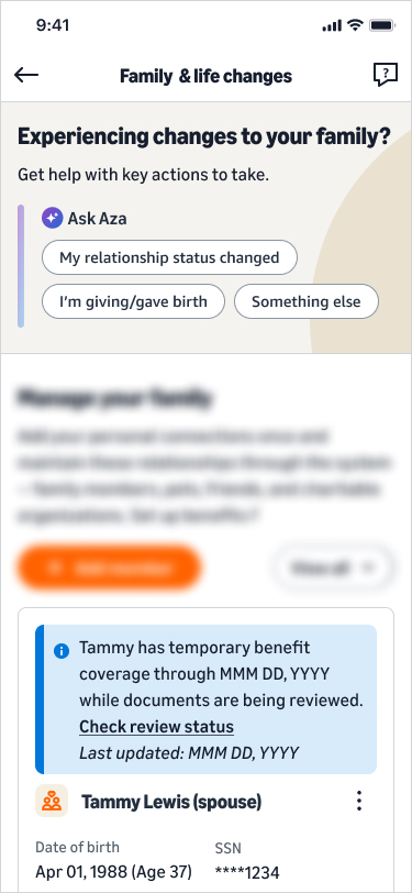
Writing the four messages was the easy half. The hard half was making them survive the journey. The systems behind this never merged, so the only thing that could make it feel like one task was a status layer that reads identically wherever the employee lands. Step through each status and watch it hold its shape across four separate surfaces: the enrollment page, the post-enrollment confirmation, saved choices, and the family page.

Reminders that respect attention
A single email blast would get ignored or mistaken for spam. Instead, reminders layer across the surfaces people already use, escalating only as the deadline nears. Act early and you see just one message. Leave it late and the nudges get more direct.
Enrollment banner, a status indicator on the dependent's profile, and suggested actions on the benefits homepage.
A personal email with the dependent's name, the exact deadline, and one clear action, seven days out.
The fourth surface: the support agent
Self-service does not remove the phone call, it changes what the call is about. Employees would still reach out, and an agent looking at a different status than the employee was reading would undo the whole layer. So the admin console got the same status, worded the same way, plus the two powers an agent actually needs.
Verification status in real time, in the same language as the employee's screen, so a call starts from a shared picture instead of a reconstruction.
Agents can grant more days themselves when someone is waiting on a birth certificate or a translation. The old process had no answer to that short of a manager.
Rollout
The system shipped in phases across the US employee base, starting with a single-state pilot and expanding outward. Each phase validated the experience before widening the population, so problems surfaced small rather than all at once.
Launched to a single state to validate the cover-first flow end to end across web, mobile, and agent tools.
Rolled out to eight more states, reaching roughly 57% of US employees, with coverage terminations for unverified dependents going live.
Why phased
A staged rollout let the team confirm the experience held up before scaling. No critical issues surfaced across the pilot or expansion populations.
reached across two phases, roughly 57% of US employees, with no critical issues before widening further
Impact
Verified eligible in the pilot
The single number that proved the thesis. The people the old process flagged weren't ineligible, they were stuck in the friction. Remove it and the vast majority sail through.
What I learned
The metric was friction, not reluctance
Slow completions read as people dragging their feet. Tracing one task across every system it touched showed the design was making them wait. That reframe changed the whole approach.
Compliance and experience aren't opposites
Legal needed verification, employees needed trust. Covering first and verifying after satisfied both instead of trading one for the other.
Design the communication layer first
Coordinating reminders across app, portal, and email was harder to align than any single screen. I'd lock that architecture with stakeholders even earlier next time.
Work with the systems, don't rebuild them
The biggest unlock wasn't merging the tools, it was navigating the ones we had. A consistent status layer across the existing surfaces gave people one clear journey without re-architecting anything underneath, which is what made it shippable.
What I'd do differently
Test the email copy with real employees before launch, design mobile-first from day one, and give people a document checklist when they add a dependent, not only when verification starts.
Smaller bets, tested earlier, on the surface where people actually complete the task.