Brand & advertising, before I designed products.

Identities, packaging, editorial and campaigns. Same method as my product work: research first, then a clear point of view.

Editorial & colour

A colour book written for one state

Research-led editorial design, where the palette had to come from the place itself.

Ranganataka, a book of colours for Karnataka

A colour and home décor guide made specifically for Karnataka. I ran primary research across Bangalore, Mangalore, Hubli and Mysore, talking to architects, contractors and dealers about how people there actually choose colour. Then I turned all of it into the book: the name, named palettes, stencil designs and textures, each one drawn from the region's culture and its more modern side.
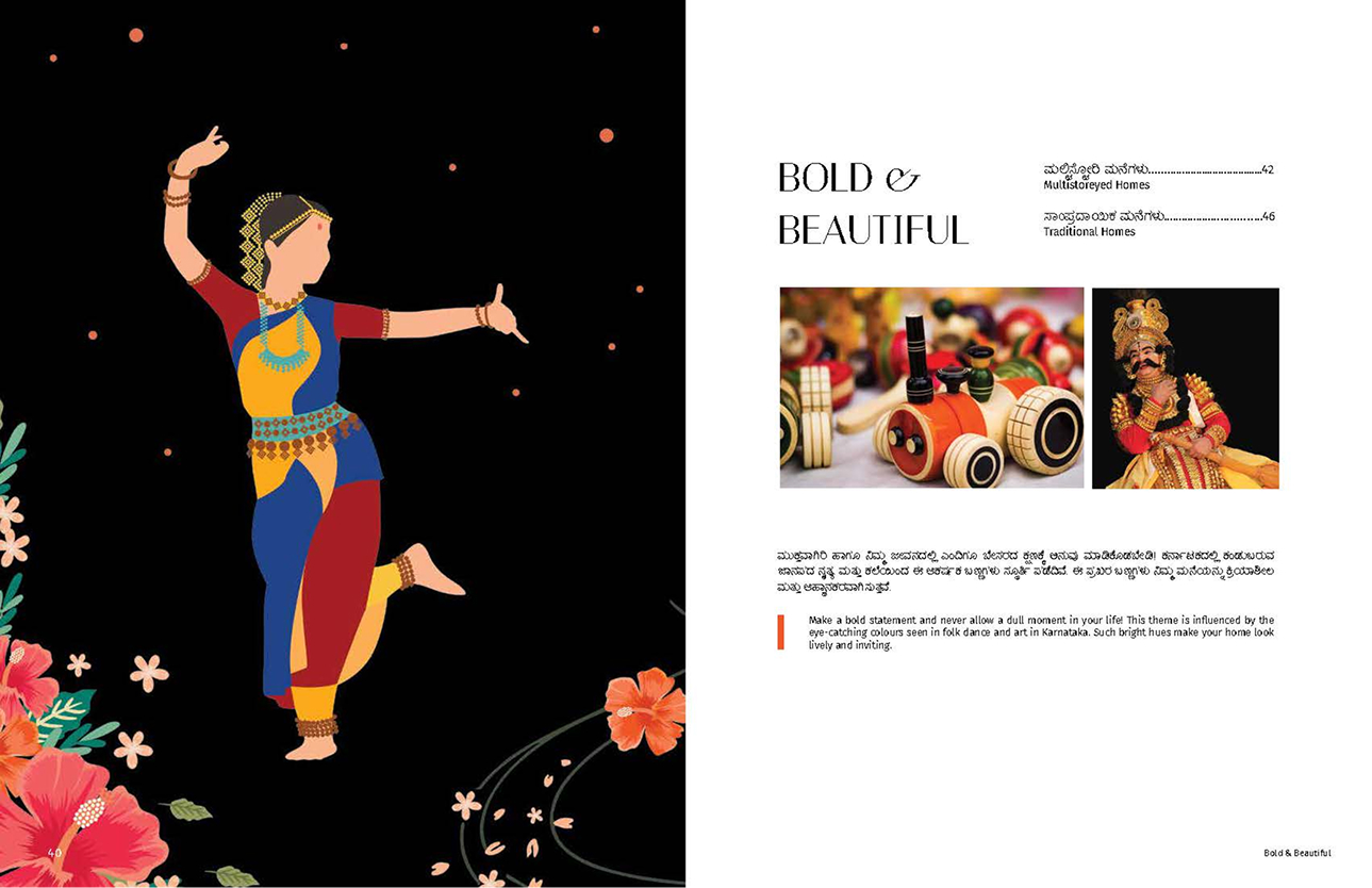
Ranganataka, Bold & Beautiful chapter opener: a Bharatanatyam dancer illustrated in bright folk-art colour on black
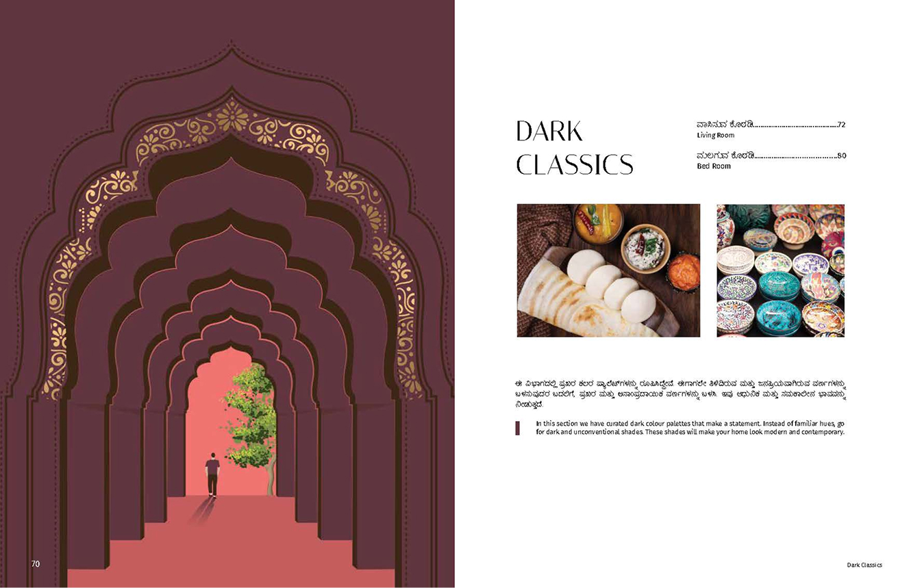
Ranganataka, Dark Classics chapter opener: layered Mughal arches in deep maroon and gold
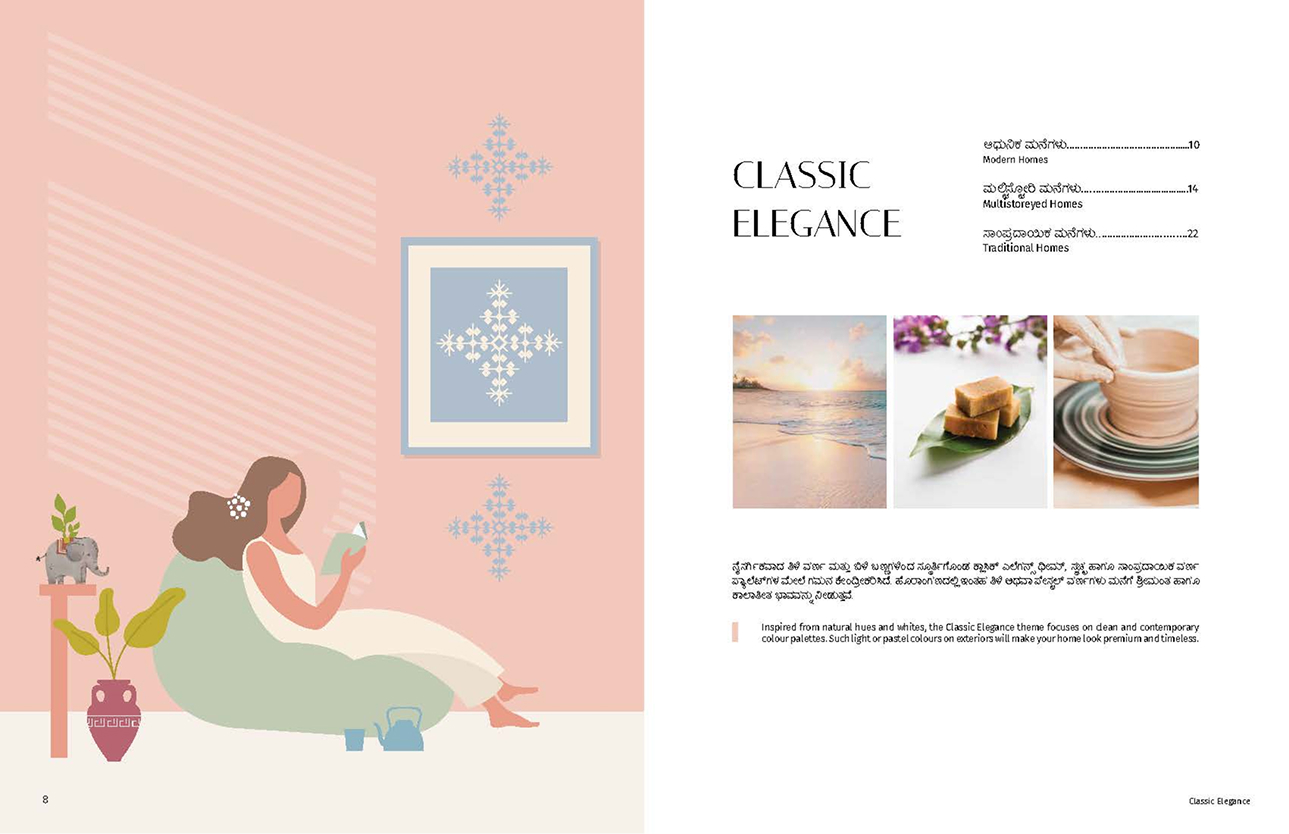
Ranganataka, Classic Elegance chapter opener with a soft pastel illustration
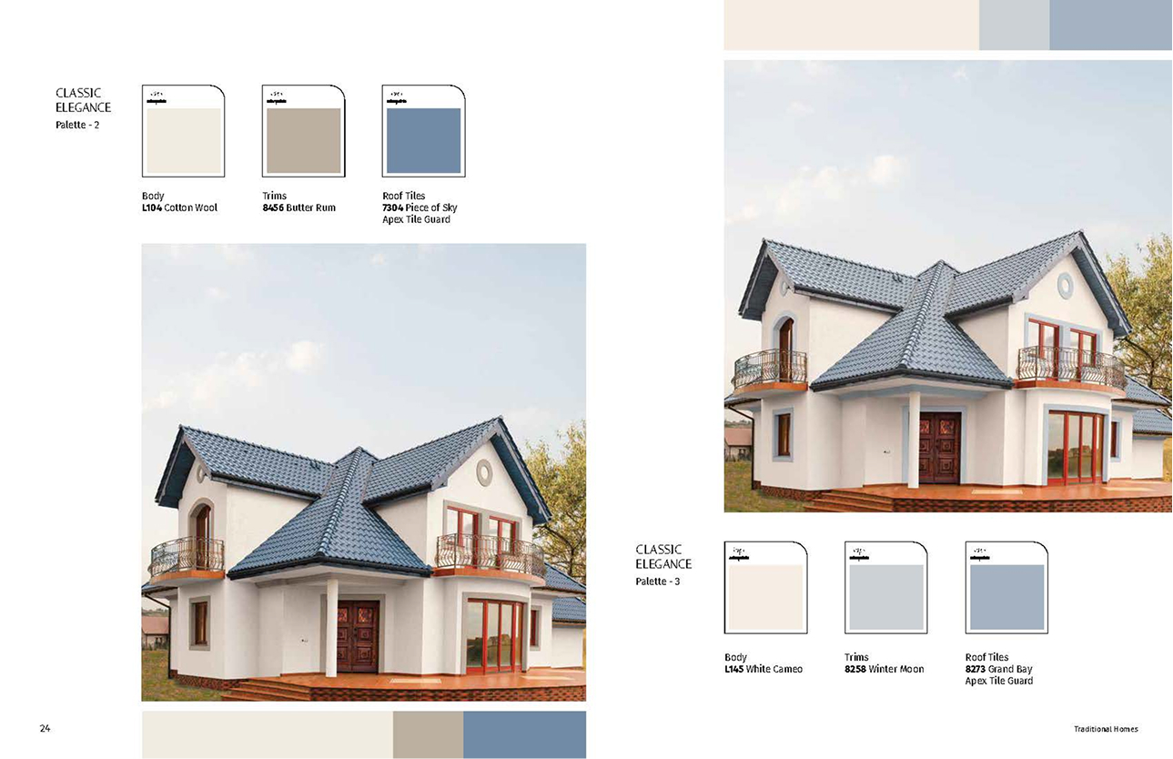
Ranganataka colour system: houses paired with Body, Trims and Roof Tiles palette swatches
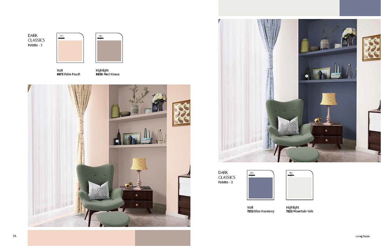
Ranganataka Dark Classics palettes shown across styled interiors with wall and highlight swatches
4 cities researched Named palette system
Brand identity

Three identities, built to survive contact

A mark is easy. A mark that still reads in gold on glass, on a paper cup, and across a newspaper spread is the actual job.

Identity for a coffee brand

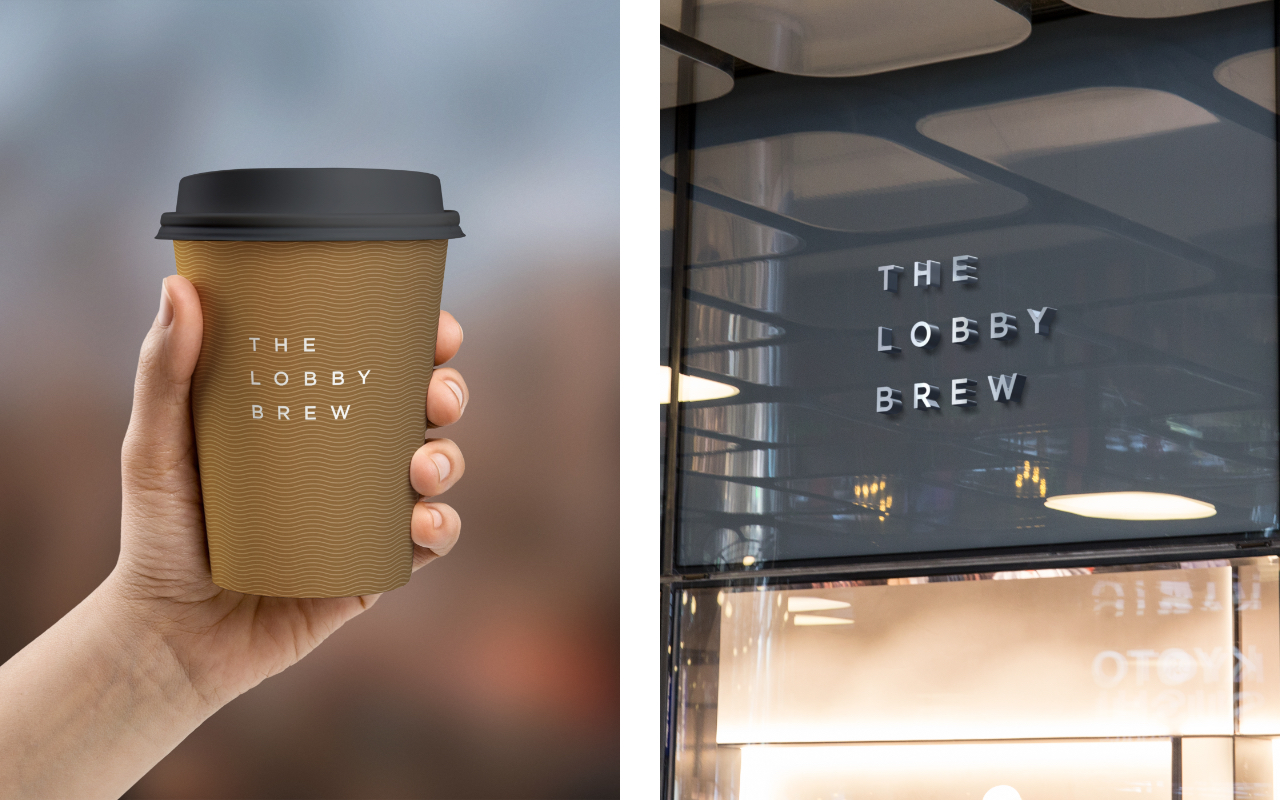
A stacked wordmark and a soft wave motif, designed to look right in gold on a window, printed on a cup, or cut into a storefront.

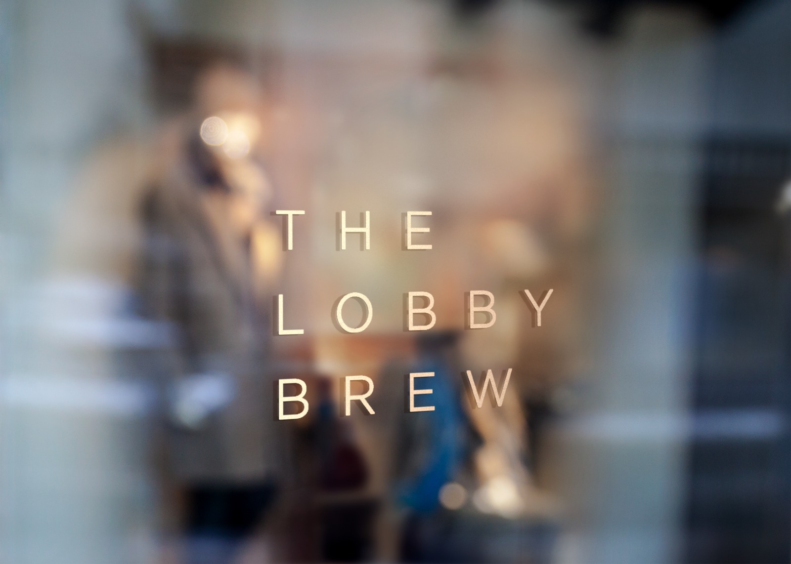
The Lobby Brew wordmark in gold on a café window, interior softly blurred behind it
The Lobby Brew takeaway cup held in hand beside the storefront signage

Identity for a property brand

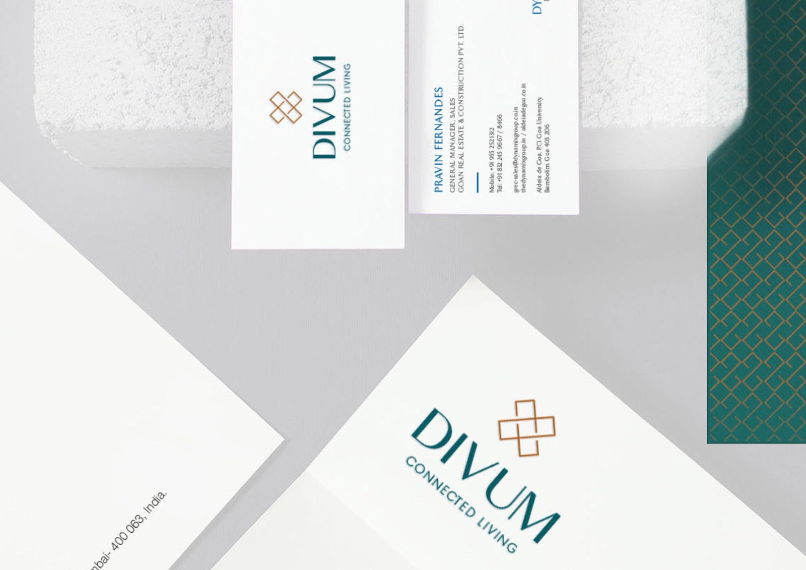
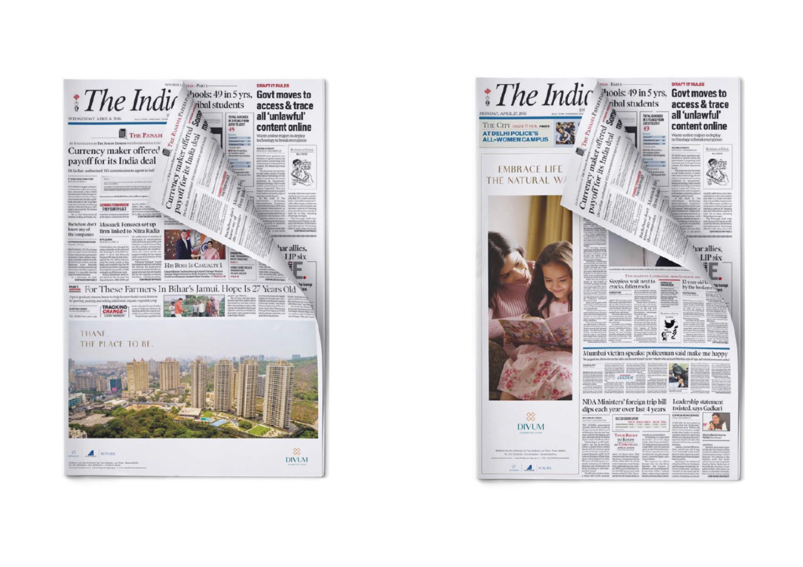
A teal-and-copper monogram and the system around it: stationery, merchandise, and full-page newspaper ads for a residential brand.

Divum stationery flat-lay: business cards and letterhead with the teal and copper monogram
Divum full-page press ads shown as folded corners of The Indian Express front page

Packaging for a wellness brand

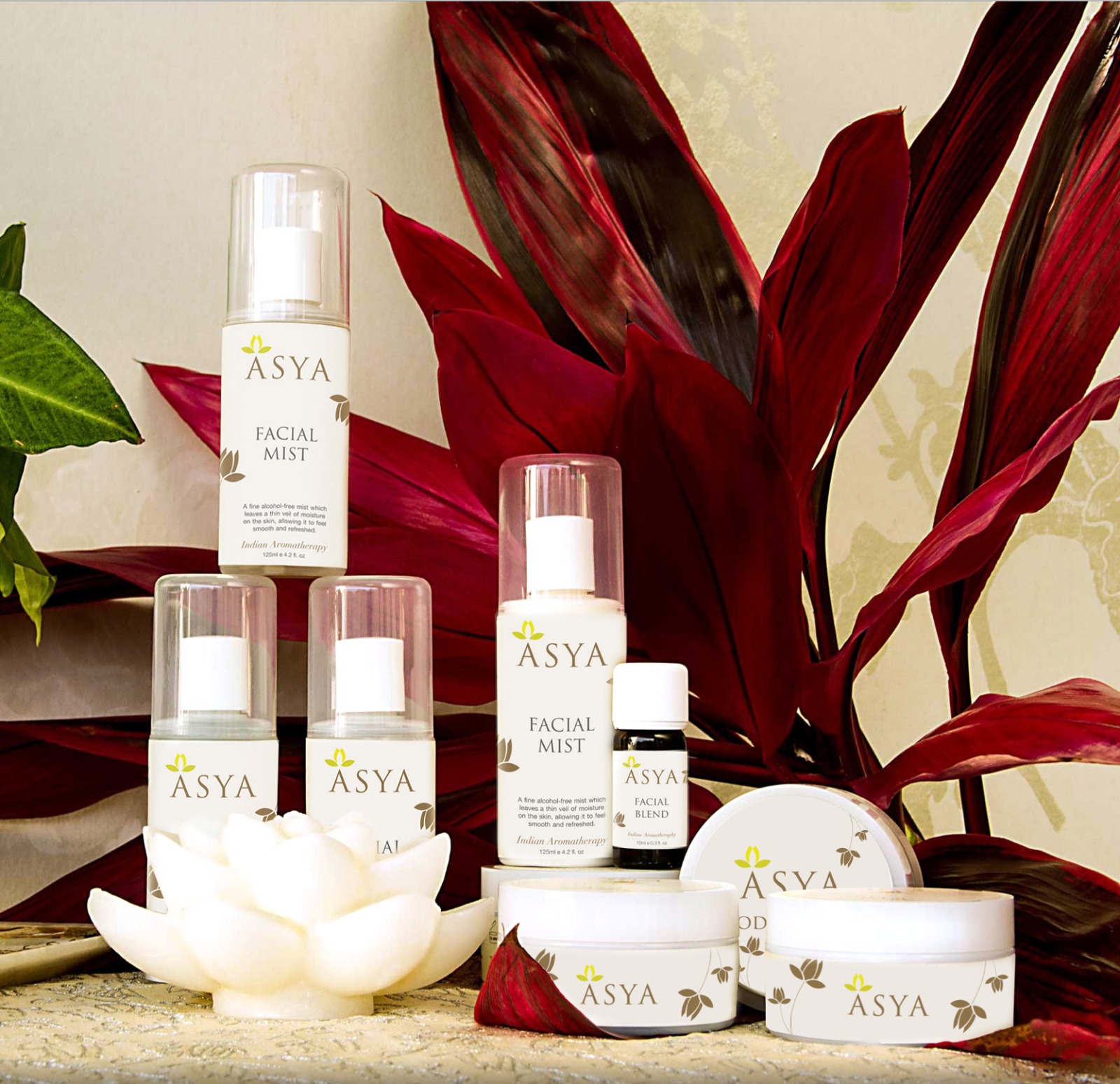
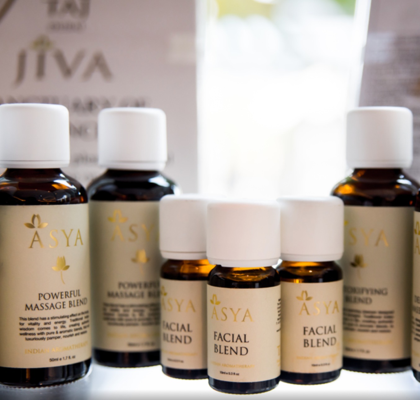
A lotus mark and warm, understated labels that hold together across a dozen products, from facial mists to body care.

Asya product range styled with deep red foliage and a lotus candle: facial mists, blends and body care
Asya amber bottles lined up: massage and facial blends with gold lotus labels

Campaigns at scale

Advertising at Amazon scale

Brand creative for placements measured in tens of millions of impressions, where a small clarity gain compounds fast.

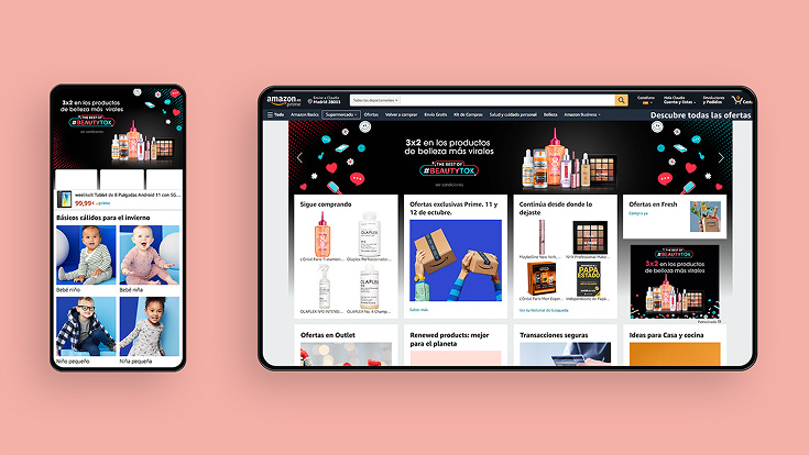
L'Oréal TikTok-themed Amazon Brand Store shown on a tablet and phone, with a #BEAUTYTOK hero

TikTok Brand Store and ads

L'Oréal wanted to carry their viral TikTok moment onto Amazon. I designed a TikTok-themed Brand Store and ad creative that borrowed the platform's native, scrollable feel while staying true to the brand.

14.5M+ impressions 7x category CTR
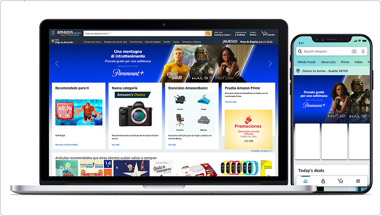
Paramount+ Hero Takeover on the Amazon homepage, shown on a laptop and phone

Homepage Hero Takeover

A high-visibility takeover of Amazon's homepage to drive Paramount+ sign-ups. I made the whole placement clickable and rotated the message every few seconds, so it caught attention without overloading anyone.

~80M impressions Lifted subscriptions
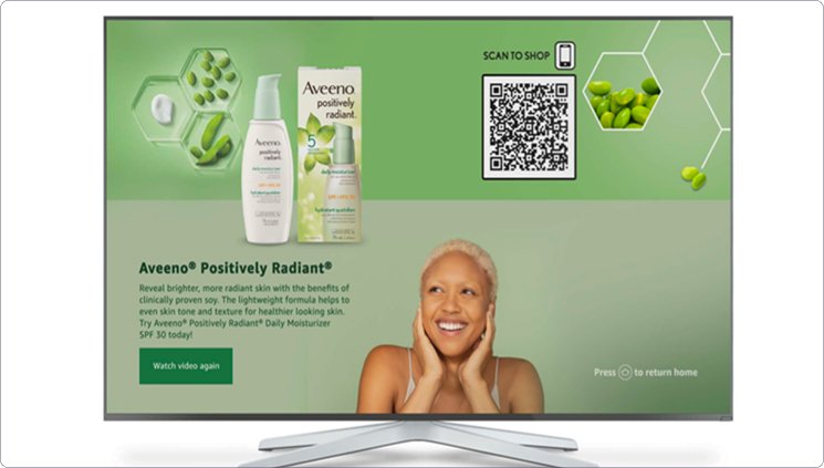
Aveeno interactive Fire TV landing page with product benefits and a scan-to-shop QR code

Fire TV shopping experience

An interactive Fire TV landing page for Aveeno's plant-based skincare, built for the living room. Action-led messaging and scan-to-shop made it easy to understand the products and buy them right from the couch.

Higher engagement Improved conversion
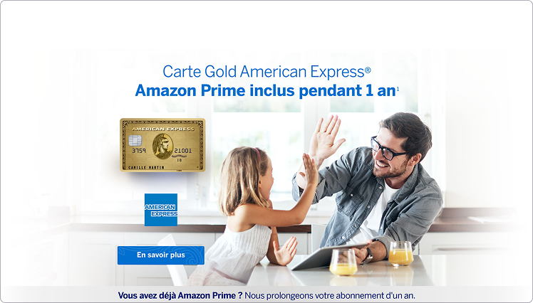
American Express Amazon Brand Store hero: Carte Gold offer with Amazon Prime included for a year

Full-funnel Brand Store

Amex's first move from a single landing page to a full Amazon Brand Store. Working with content and brand teams, I built a richer, more cohesive experience that held attention longer.

First LP to Brand Store Longer dwell time

Back to

Product design work →